The Olive Green Room Rulebook: How to Use 2026's Biggest Color Without It Feeling Like a Forest
Olive green walls aren't too much. They're the whole point. A full guide to greens that age well, the three-material formula, and picks at every budget.
Every design blog this year is telling you to “add a pop of green.” A sage throw pillow. A eucalyptus sprig in a ceramic vase. Maybe, if you’re feeling adventurous, a green accent wall. That advice produces rooms that look like someone almost made a design decision. I know because I spent three weeks staring at a Benjamin Moore fan deck, convinced that painting my entire living room Tarrytown Green HC-134 was going to be a catastrophic mistake. Then I did it anyway. Every single person who’s walked in since has called it the coziest room they’ve ever been in. None of them could explain why. The color was doing all the work, and I’d almost talked myself out of it.
Why Green Terrifies People (And Why That Fear Is Costing You the Best Room in Your House)
Green carries baggage. People hear “green walls” and picture their grandmother’s avocado kitchen circa 1974, or the hunter green and burgundy combo that haunted every suburban dining room in the ’90s. Those associations are real, but they’re also specific to very specific greens. Avocado and hunter green aged badly because they were paired with materials that also aged badly: glossy oak trim, floral wallpaper borders, brass-plated (not solid brass) fixtures.
The greens dominating right now share almost nothing with those shades except a place on the color wheel. Olive, sage, moss, and eucalyptus sit in a completely different tonal family. They read warm or neutral depending on the light. They recede instead of shouting. And they do something almost no other color family can do: they make a room feel simultaneously calm and alive.
There’s actual science behind this. Research in environmental psychology has consistently found that green environments reduce cortisol levels and improve perceived comfort. Your brain reads green as safe. It’s the color of shade, of sheltered spaces, of “you can rest here.” That’s not a trend. That’s biology.
So why does every guide tell you to use it sparingly? Because sparingly is safe advice. It’s advice that can’t go wrong. But it also can’t go very right. A green pillow on a beige sofa is fine. It’s also forgettable. The rooms people actually remember, the ones that make them stop in the doorway and say “oh, this feels good,” those rooms committed.
The Greens That Age Well vs. The Ones That Date a Room
Not all greens deserve your walls. Here’s where I get specific, because “green” covers about 400 paint chips and roughly 390 of them are wrong for full-room commitment.
Greens that will still look good in ten years:
- Olive (Benjamin Moore Tarrytown Green HC-134, Farrow & Ball Sap Green No.W56). Olive has a brown undertone that keeps it grounded. It shifts warm in incandescent light and reads almost neutral in daylight. This is the safest entry point for people who are nervous.
- Sage (Benjamin Moore Sage Mountain 1488, Sherwin-Williams Evergreen Fog SW 9130). Sage has grey in it, which means it plays well with cool-toned furniture. It’s the green that looks most like a neutral. If olive feels too bold, start here.
- Moss (Benjamin Moore Dakota Shadow 1495, Portola Paints Moss). Deeper and moodier than sage. This is the one for bedrooms and rooms with limited natural light. (Yes, dark colors in dark rooms. I know it sounds counterintuitive. It works. I wrote about why in the color drenching guide.)
- Eucalyptus (Benjamin Moore Cushing Green HC-125, Clare Paint Eucalyptus). Cooler, slightly blue-leaning. This one’s beautiful but pickier about what you pair it with. Test it in your actual space before committing.
Greens that will date your room:
- Kelly green. Too saturated. It reads “statement” in a way that exhausts you after six months. Great for a front door. Not for four walls.
- Forest pine (the deep blue-green that was everywhere in 2019). Already feels like a timestamp. If you see it and think “moody Instagram flat,” that’s exactly the problem.
- Mint. It reads juvenile unless you’re working with mid-century architecture that was literally designed for it. In a modern apartment, it just looks like a nursery.
- Neon or chartreuse anything. I shouldn’t have to say this, but I’ve seen things.
The pattern is clear: greens with brown, grey, or warm undertones age well. Greens that are pure, bright, or blue-heavy become associated with the exact moment they were trendy.
The Three Materials That Make Olive Green Feel Editorial, Not Earthy
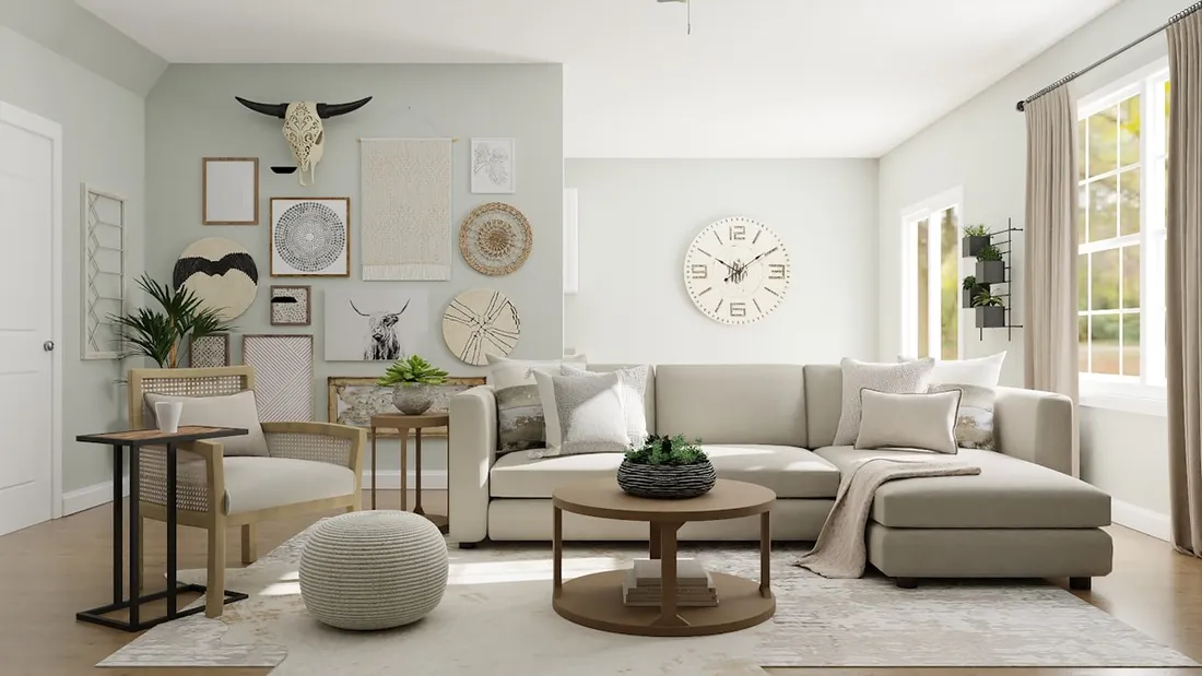
Here’s the thing about green walls that nobody tells you: the paint is only half the equation. The materials you put against it determine whether the room feels like an editorial spread or a cabin in the woods. I call it the three-material formula, and it hasn’t failed me yet.
1. Unlacquered brass (or aged bronze). Not polished brass, not brushed nickel. Unlacquered brass develops a patina over time, and that warm, slightly imperfect metallic is the perfect counterweight to green’s organic quality. Think cabinet pulls, lamp bases, curtain rods, picture frames. The metal reads warm without competing with the wall color. A polished chrome faucet next to an olive wall creates a visual argument. Brass creates a conversation.
2. Warm linen or washed cotton. The texture matters more than the color here. Linen has a weight and a slight roughness that grounds a green room. You can feel the difference between a linen curtain panel and a polyester one even from across the room. One drapes with gravity. The other just hangs there. Go for oatmeal, cream, or flax tones. White linen works too, but make sure it’s a warm white (think Benjamin Moore White Dove OC-17 range, not Chantilly Lace bright).
3. Raw or oiled wood. Not stained, not painted, not laminate. The grain and warmth of actual wood (walnut, white oak, or even a lighter ash) creates the third point in the triangle. These three materials together, brass, linen, and real wood, give a green room depth without clutter. Each surface catches light differently. The brass glows. The linen absorbs. The wood grounds. That layering of light response is what makes a room feel considered instead of themed.
I landed on this formula by accident, honestly. When I painted the Tarrytown Green wall, the room had a walnut mid-century credenza I’d found on Facebook Marketplace, cream linen curtains from IKEA (the DYTÅG panels, about $35 a pair), and a brass table lamp I’d picked up at an estate sale for $28. I didn’t plan the combination. But the first time I sat in that room after the paint dried, something clicked. It felt like every surface was in agreement. I’ve since tested it in three other spaces and it holds up every time.
Where to Commit: Which Room Gets the Most from Going All-In
Not every room benefits equally from a full green treatment. The rooms that gain the most are the ones where you spend time sitting still. Living rooms, bedrooms, reading nooks. Spaces where you actually rest. The calming effect of green needs a few minutes to register. In a room you walk through quickly, like a hallway or mudroom, it’s nice but you don’t get the full payoff.
Bedrooms are the sleeper pick (sorry). A bedroom painted in a deep olive or moss, especially with color drenching where you carry the color onto the trim and ceiling, becomes genuinely cocoon-like. The effect when you walk in at night is extraordinary. The walls seem to pull inward in the best possible way.
Living rooms are the obvious choice, and obvious for good reason. It’s the room guests see. It’s where the “oh, this feels good” moment happens. If you’re doing one room, do this one.
Kitchens are trickier. I wrote about cabinet colors in the kitchen cabinet guide, and green cabinets can be stunning, but they need very specific countertop and hardware pairings to avoid going full cottage-core. Olive-toned cabinets with a honed marble or butcher block counter and unlacquered brass pulls? Incredible. The same cabinets with grey quartz and brushed nickel? It’s fighting itself.
Bathrooms work if they’re small. A tiny powder room in deep green is a jewel box. My own bathroom (Benjamin Moore Essex Green HC-188) is still the best design decision I’ve ever made, and it’s the size of a closet.
Skip the home office. You need clarity and focus in a workspace, and green’s calming quality can actually make you drowsy. That’s the biology working against you. Save green for the rooms where drowsy is the point.
Building the Full Palette: What Sits Next to Green Without Fighting It
Green is generous with other colors, but only if you understand which ones to reach for.
The safe companions:
- Warm whites and creams. Your trim, your ceiling (unless you’re drenching), your upholstery base. Not stark white. Stark white next to olive green creates too much contrast and makes the green look darker than it is. Benjamin Moore White Dove OC-17 or Simply White OC-117 are both reliable here.
- Rust and terracotta. This is the accent color olive green has been waiting for. A rust-colored linen pillow, a terracotta planter, even a burnt sienna throw blanket. The warmth of these tones makes the green lean cozier. I have a rust linen pillow from Target (Threshold, $12) that looks like it was custom-made for my green living room.
- Warm wood tones. Already covered in the materials section, but it bears repeating: walnut, white oak, and honey-toned woods all work. Avoid grey-washed or whitewashed wood. Those cool tones clash with olive’s warmth.
The bold-but-it-works companions:
- Dusty pink or clay pink. I know. But trust me. A muted pink (not hot pink, not millennial blush) against olive green creates a contrast that feels lifted from a Dutch Golden Age painting. It shouldn’t work. It does. Every time.
- Deep navy. Only in small doses. A navy book spine, a dark blue ceramic, a piece of art with navy tones. Not as a second wall color. Two dark wall colors in one room is a dorm room move.
What to avoid:
- Grey. Cool grey kills the warmth in olive green. The room goes flat. This is the most common mistake I see.
- Black as a dominant accent. Black furniture, black frames, black hardware. A little is fine. Too much and the room starts feeling like it’s trying to be a moody Instagram flat from 2019 instead of an actual living space.
- Other greens. Having your green walls surrounded by green plants, green pillows, green art, and a green rug is how you end up in a forest. The whole point of committing to green walls is that the walls carry the color story. Everything else gets to be warm, textured, and mostly neutral.
This palette philosophy shares some DNA with Japandi interiors and Scandinavian living rooms. Both traditions understand that a limited material palette creates more visual calm than a room stuffed with variety.
Shoppable Picks: Paint, Furniture, and Accents at Three Price Points
I’m breaking this into budget, mid, and investment tiers, because the three-material formula works at every price point. You don’t need a designer budget to make olive green sing.
Paint
- Budget: Benjamin Moore Tarrytown Green HC-134 (about $55/gallon at most retailers). This is the one I used. It’s forgiving, it reads well in both natural and artificial light, and it has enough brown in it to avoid looking clinical. One gallon covers a small bedroom. Budget two for a living room.
- Mid: Portola Paints Moss (about $95/gallon). Portola’s Roman clay finish adds a subtle texture to the wall that photographs beautifully and feels like plaster when you run your hand across it. The extra cost is in the finish, not just the color.
- Investment: Farrow & Ball Sap Green No.W56 ($115/gallon). The depth of pigment is real. Farrow & Ball paints change noticeably between morning light and evening lamplight in a way that cheaper paints simply don’t.
The Sofa
Your sofa against green walls should be neutral, textured, and warm. Not grey. Not black. Cream, oatmeal, camel, or warm tan.
- Budget: IKEA KIVIK in Hillared Beige ($549). Solid bones. The fabric pills a bit after a year, but the frame is sturdy and the proportions are right. Throw a linen cover on the seat cushions if the fabric starts looking tired.
- Mid: Article Sven in Birch Ivory ($1,399). I’ll keep recommending this sofa until they stop making it. The leather develops a patina that gets better with age, and the tufting is subtle enough to not read as mid-century cliche. It’s comfortable. Actually comfortable, not “looks comfortable in photos” comfortable. You sink into it and the leather warms under you.
- Investment: Room & Board Hess Sofa in leather ($3,200+). American-made, and the frame is built to survive decades. If you’re going to have one forever piece, this is it.
Brass Accents
- Budget: The IKEA ÅRSTID table lamp ($24.99). It’s not unlacquered, but the brass tone is warm enough to work. For $25, it does 80% of what a $200 lamp does.
- Mid: Schoolhouse Electric Montrose Pendant ($249). If you can change your overhead lighting (renters, check your lease, some landlords allow it if you reinstall the original before you leave), this single swap changes the entire feel of the room. The unlacquered brass patinas over months and develops a character that matches the richness of green walls.
- Investment: Rejuvenation Eastmoreland Sconce in aged brass ($189 each, and you’ll want a pair). Wall-mounted, warm, and the light they throw is directed downward in a way that makes green walls glow at night.
Linen and Textiles
- Budget: IKEA DYTÅG curtain panels in natural ($34.99/pair). Linen-blend, heavy enough to drape properly, and the color is a perfect warm neutral. These have been in my living room for over a year and they’ve only gotten softer.
- Mid: Quince European Linen Throw Pillow Covers ($30 each). Real linen, well-priced, and they come in the exact rust and oatmeal tones that work against green.
- Investment: Cultiver Linen Bedding in Natural ($250+ for a duvet cover). If you’re doing a green bedroom, this is the linen that makes the bed feel like the centerpiece. The weight of it is substantial. You can feel the difference the moment you pull it up.
Wood
- Budget: Facebook Marketplace. I’m serious. Search “walnut table,” “mid-century credenza,” or “wood bench” and sort by distance. The $40-$80 range is full of solid wood pieces that just need a light sanding and a coat of Danish oil. My credenza cost $65 and it looks better than anything at West Elm.
- Mid: Article Lenia Coffee Table in walnut ($449). Clean lines, real walnut veneer over solid wood, and the low profile keeps it from visually competing with the walls.
- Investment: Room & Board Walsh End Table in walnut ($599). Solid walnut. Simple. The grain is the design. It’ll look better in five years than it does the day you buy it.
Look, I get the hesitation. Green feels permanent. It feels like a choice you can’t undo. But here’s what I’ve learned from my own Tarrytown Green experiment: the worst that happens is you repaint. That’s a weekend and $110 in supplies. The best that happens is you walk into a room that makes your shoulders drop two inches every time. The best rooms I’ve been in didn’t play it safe. They made one brave choice and built everything else around it. A gallon of olive green paint might be yours.