Quiet Luxury Bedrooms: The 5 Material Upgrades That Make a Room Feel Expensive
Quiet luxury bedrooms aren't about all-white everything. These 5 material swaps at three price points make any bedroom feel expensive this spring.
Every bedroom on Instagram in 2023 looked the same. White duvet, white pillows, white nightstand, maybe a dried pampas grass arrangement in a clear vase. It photographed beautifully. It also looked like a hotel room in a city you can’t remember visiting. I know because I tried it. My bedroom entered its all-white era and stayed there for about eight months, and by the end I felt like I was sleeping inside a cloud that had given up on life.
The problem wasn’t white. The problem was sameness. And three years later, that sameness has a new tell: it reads as cheap.
The All-White Bedroom Looked Aspirational. Until It Didn’t
Here’s the thing about the all-white bedroom trend. When it started, it signaled restraint. Editing. A person who had curated their space down to essentials. But then Target carried it. Then Amazon carried it. Then every apartment listing on Zillow staged bedrooms with the exact same white waffle-weave duvet cover, the same linen-look shams, the same round mirror above a white oak nightstand.
Once something is available at every price point and every retailer simultaneously, it stops communicating taste. It communicates timing. “I bought all of this in the same season from the same store” is the opposite of what a bedroom should say about you.
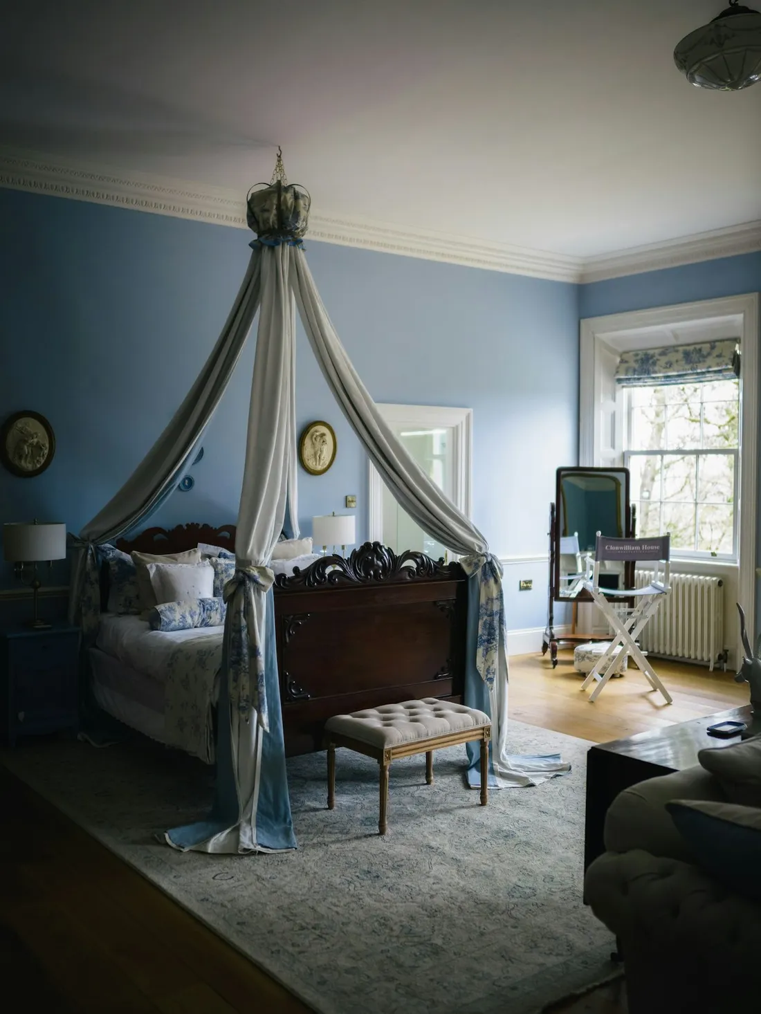
Quiet luxury comes down to material. Color is secondary. A white bedroom can absolutely feel rich, but only if the white cotton is heavy enough to drape properly, the hardware has patina instead of plating, and at least one surface in the room has visible grain, age, or texture that couldn’t be replicated by injection molding.
The rooms that actually feel expensive right now share a few traits: they mix eras, they prioritize touch over appearance, and they let materials do the talking instead of a color palette. This is good news if you’re working with a real budget, because the upgrades that matter most aren’t the biggest purchases. They’re the most specific ones.
Why the Lamp Changes First, Not Last
Most people start a bedroom refresh with bedding. It makes sense. The bed is the largest surface in the room. But bedding is also the thing your eye adjusts to fastest, because you see it from the same angle every single night. A new duvet cover gives you about seventy-two hours of “this feels different” before it becomes background.
Lighting, on the other hand, changes how every other object in the room looks.
I learned this by accident. I’d been using a plastic clip lamp on my nightstand for over a year. It was functional. It was also the visual equivalent of a shrug. I found an aged brass reading lamp at a thrift store on SE Hawthorne for $45. Solid weight, real patina, a linen drum shade that had gone slightly warm with age. I swapped it in on a Saturday afternoon.
Three separate people asked if I’d “done something to the room” that week. Not one of them identified the lamp. Danny thought I’d repainted. My friend Sarah (actual interior designer, remember) said it “felt warmer.” The lamp changed the quality of light in the room, which changed how the wall color read, which changed how the bedding looked. One swap. Cascading effect.
This is why the lamp comes first in any spring bedroom refresh. If you haven’t read our full lighting guide, the short version is: the quality of light in a room is more important than the color of the walls, the bedding, or the furniture. Warm light from a real shade softens everything. Cool light from a bare bulb or a plastic fixture flattens everything. The lamp is the single highest-impact swap per dollar you can make.
Weighted Cotton, Unlacquered Brass: Why Texture Beats Color Every Time
Color is what most people reach for when they want a room to feel “better.” A new accent pillow, a different wall color, a throw in a trending shade. But the rooms that actually feel considered aren’t built on color. They’re built on material contrast.
Pick up a cheap polyester pillowcase and a washed cotton one with the same thread count in the same shade of white. The poly one feels slick and hollow. The cotton one has weight. It resists your hand slightly before giving way. That difference in feel translates directly into how the room reads visually, because materials with genuine texture catch light differently. They create micro-shadows. They look dimensional instead of flat.
This is why unlacquered brass reads so differently from brushed nickel or chrome. Unlacquered brass develops a patina over time. It darkens where hands touch it. It stays bright where it doesn’t. The hardware tells a story about use, and that story is what makes a room feel lived-in rather than staged. Chrome says “showroom.” Patina says “someone chose this, and it’s been here a while.”
The same principle applies to wood. A nightstand with a perfect factory finish in “driftwood gray” looks like what it is: a photo of wood, printed on particleboard. An actual aged-wood nightstand, even a simple one, has variation in grain, slight differences in tone, maybe a ring stain from a coffee cup three owners ago. That imperfection is the luxury. You can’t manufacture it. You can only find it or wait for it.
Five Material Upgrades, Ranked by Visual Impact
I’ve been thinking about this as a sequenced path, not a shopping list. The order matters because each swap makes the next one land harder. Here’s how I’d spend the money, starting with the change that does the most work.
1. A Linen-Shade Reading Lamp (or Bedside Lamp)
The fastest single upgrade. Replace any exposed-bulb, plastic-shade, or chrome-arm lamp with something that has a real fabric shade and a warm-toned base.
- Budget ($30-40): Thrift stores and estate sales. I’m not being cute here. Brass and ceramic lamps from the ’80s and ’90s are everywhere, usually $15-40, and they’re often better quality than new options at twice the price. Check the socket and rewire if needed (kits are $12 at any hardware store).
- Mid ($80): The Target Threshold Aged Brass Table Lamp with linen shade. It’s not real brass, but the finish is surprisingly convincing and the proportions are right.
- Investment ($180-220): Rejuvenation’s Eastmoreland Table Lamp. Solid brass, real linen shade, American-made. This is a forever lamp. Worth every dollar.
2. One Warm Contrast Pillow
Not a matching sham. Not a decorative pillow that came in a “set.” One single pillow in a color and texture that breaks the pattern of the rest of the bed. This is the thing that keeps the room from going sterile.
After I swapped the lamp, I added a single linen pillow cover in warm terracotta. (Yes, I bought it at Target. The Threshold linen collection. $14. I have no shame about this.) Against the white bedding, it did more work than the four matching euro shams I’d been using. It gave the eye a place to land.
- Budget ($12-18): Target Threshold linen pillow covers in any warm earth tone. The rust, the terracotta, and the olive are all solid.
- Mid ($55-75): Cultiver linen pillowcases in Cedar or Olive. Heavier weight, beautiful drape, and they soften beautifully after a few washes.
- Investment ($95-130): Hawkins New York Simple Linen pillow covers. The weight of these is absurd in the best way. Picking one up feels like holding something that costs three times its price.
3. Upgraded Bedding (Weighted, Washed Cotton or Linen)
Now that the lighting is warm and the bed has a focal point, the bedding itself can do its job. The goal here isn’t a specific color. It’s weight and texture. You want fabric that drapes with gravity instead of puffing up like a marshmallow.
- Budget ($35-50): The Casaluna Heavyweight Linen Blend duvet cover at Target. It’s not pure linen, but the cotton-linen blend has real body and it washes well.
- Mid ($80-120): Brooklinen Washed Sateen duvet cover. The sateen has a subtle sheen without looking slippery, and the washed finish gives it that slightly rumpled look that photographs well and feels even better.
- Investment ($200-280): Matteo Home Vintage Linen duvet cover. This is the one where, if someone sits on your bed, they’ll ask what brand it is. The hand feel is genuinely different from anything at a lower price point. It gets softer every wash for about the first year, then just stays perfect.
4. An Aged-Wood or Vintage Nightstand
Matching nightstands are fine. (Really. They are.) But swapping even one of them for something with actual material history changes the entire bedside read. You’re looking for visible wood grain, signs of age, or at minimum a finish that isn’t perfectly uniform.
- Budget ($30-75): Facebook Marketplace, estate sales, or Habitat for Humanity ReStores. Look for solid wood, not veneer. Open the drawers. If the interior is real wood and the joints are dovetailed, you’ve found something good. Sand it lightly, hit it with one coat of matte poly, and you’re done.
- Mid ($90-150): The IKEA STOCKHOLM nightstand in walnut veneer. I know I just said to look for solid wood, but this is one of the few IKEA pieces where the veneer is thick enough and well-matched enough to read as real. It’s a genuinely good design.
- Investment ($200-400): Room & Board’s Emerson nightstand in walnut. Solid wood, clean lines, American-made. This is the nightstand you keep for twenty years.
5. Unlacquered Brass Hardware
If your nightstand or dresser has hardware (knobs, pulls), this is the quiet upgrade nobody expects. Swapping chrome or brushed nickel pulls for unlacquered brass ones takes ten minutes with a screwdriver and costs less than dinner.
- Budget ($3-5/knob): Emtek unlacquered brass knobs on Amazon. They’ll patina within a few months. That’s the point.
- Mid ($8-12/knob): Rejuvenation’s Massey knobs. Solid brass, slightly heftier, and they sell matching pulls if you need both.
- Investment ($15-25/knob): Schoolhouse’s Brass Utility Knobs. These feel like small brass weights. Picking one up for the first time is a little startling. They’re dense in a way that tells your hand this is a real material, not a plated surface.
What Does “Quiet” Mean When the Room Still Has to Feel Alive?
I think people hear “quiet luxury” and mentally translate it into “boring on purpose.” That’s not it. Quiet doesn’t mean absence. It means the room communicates through materials and craftsmanship instead of through bold pattern, bright color, or obvious branding.
A quiet room still has contrast. It still has warmth. It still has at least one moment where your eye catches on something and lingers. The terracotta pillow against white linen is quiet. A neon throw pillow that says “SLEEP” in block letters is not. Both add color. Only one adds character.
The intentional design philosophy I keep coming back to is that every object should either be beautiful, useful, or both. In a bedroom, “useful” has a specific meaning: does this help me sleep, rest, or feel calm? If a decorative object creates visual noise that your brain has to process before it can relax, it’s not just unnecessary. It’s working against the room’s purpose.
Neuroarchitecture research backs this up. Studies on sleep environments consistently show that rooms with fewer distinct visual elements but higher material quality correlate with faster sleep onset. Your brain isn’t counting objects. It’s assessing whether the environment is safe and settled. Surfaces that look cheap or temporary signal instability at a level you don’t consciously register, but your nervous system does.
The Spring Reset Sequence: What to Change First, Second, and Last
If you’re doing a spring bedroom refresh and you can’t swap everything at once (most of us can’t), here’s the order I’d recommend. This isn’t arbitrary. It’s based on which change amplifies the ones that follow.
Week 1: The lamp. Swap it. Even if the only option you can afford is a $20 thrift store find, do this first. Everything else in the room will look different under better light.
Week 2: The contrast pillow. One pillow. A warm tone. Linen or heavyweight cotton. This takes thirty seconds to add and immediately breaks the monotony of matched bedding.
Week 3: The bedding. Now that the light is warm and the bed has a focal point, upgrade the duvet cover or top sheet to something with real weight. You’ll feel this one physically, not just visually. The difference between sleeping under lightweight poly-blend and washed cotton with actual heft is the difference between a fitted sheet and a weighted blanket. (Not literally. But the sensation of “settling in” is similar.)
Week 4: The nightstand or hardware. This is the slowest swap because it requires either shopping vintage (which takes patience) or ordering and waiting. But by now, the rest of the room has shifted enough that you’ll know exactly what tone and finish feels right. You’re not guessing. You’re responding to what’s already there.
If you’re working with a small bedroom, this sequence works even better, because every swap is proportionally more impactful in a smaller space. My bedroom is about 11 by 12. Not generous. Every surface choice carries more weight when there are fewer surfaces.
Keeping It From Going Beige: The One Rule That Holds the Look Together
I went through my “everything beige” phase. I’ve talked about it before. Cream sofa, oatmeal throw, sand-colored curtains. My apartment looked like the inside of a bread bowl. I’ve since learned that the antidote to monotony isn’t more color. It’s more material variance within a limited palette.
Here’s the rule: in any “quiet” room, you need at least three distinctly different textures visible from the primary vantage point (in a bedroom, that’s lying in bed, looking toward the foot). Smooth cotton, rough linen, warm brass. Or: washed percale, nubby wool, aged walnut. Or: matte ceramic, woven cotton, hammered metal.
The materials don’t need to contrast in color. They need to contrast in how they catch light. A matte surface absorbs it. A brushed metal surface scatters it. A linen weave filters it. When your eye moves across surfaces that handle light differently, the room feels rich without feeling busy. That’s the whole trick. That’s what separates a quiet luxury bedroom from a boring one.
If you get nothing else from this post, try the lamp. Just the lamp. A warm brass base, a linen shade, and a 2700K bulb. Put it on your nightstand tonight and see what happens to the rest of the room. I think you’ll be surprised how much a single material upgrade can change a space that you thought needed a complete overhaul.
Sometimes the room doesn’t need more. It needs better.